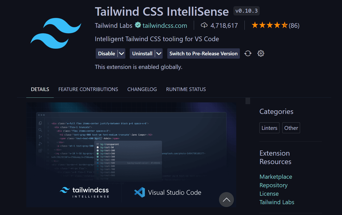
Tailwind CSS represents a paradigm shift in CSS frameworks - moving from component-based to utility-first design. This approach provides unprecedented flexibility and performance while maintaining consistency across your application.
Why Tailwind CSS Excels: - Utility-First Approach: Compose designs directly in your markup - No Context Switching: Style components without leaving your HTML/JSX - Customizable: Configure every aspect to match your design system - Performance: Purge unused styles for tiny production bundles - Dark Mode: Built-in dark mode support with minimal effort
Core Concepts
- Utility Classes: Pre-defined classes for common CSS properties
- Responsive Design: Mobile-first breakpoints with intuitive syntax
- State Variants: Hover, focus, active states with simple prefixes
- Custom Configuration: Extend with your brand colors and spacing
Best Practices: - Extract repetitive patterns into components - Use @apply directive for common patterns - Configure theme in tailwind.config.js - Leverage JIT mode for on-demand utility generation
Integration with React/Next.js: Tailwind integrates perfectly with component-based frameworks. Style your components inline with utility classes while maintaining component reusability and maintainability.
Production Experience: Tailwind has become my default choice for all new projects. The development speed increase is remarkable, and the resulting CSS bundles are often 10x smaller than traditional approaches.